Jun 25, 2024
Accessibility improvements for drag-and-drop form builders
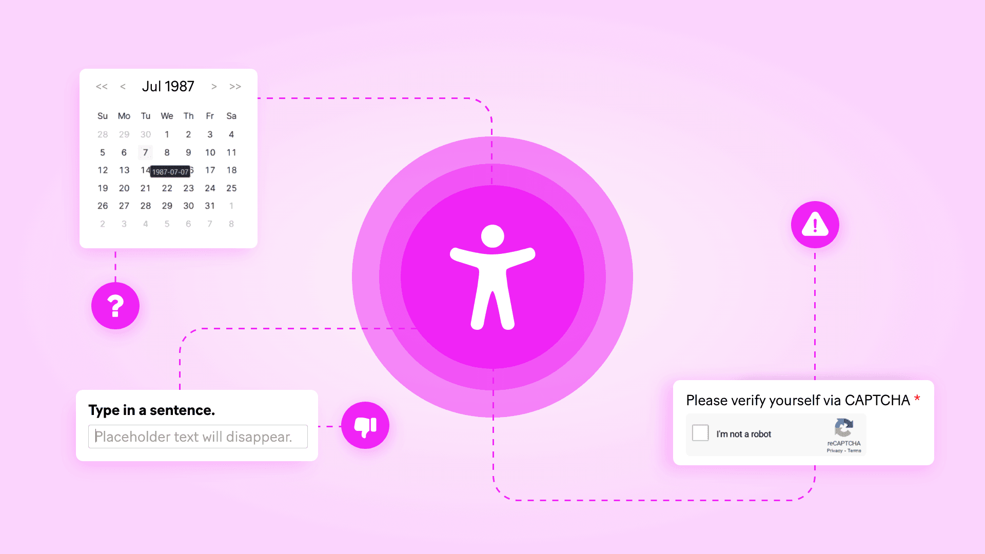
In this guest post from Fillout, Dominic Whyte (co-founder at Fillout) explores how you can boost the accessibility of your web forms.
Digital accessibility awareness and efforts have been steadily gaining steam over the past few years. In 2021, Forrester Research found that “84% of companies are doing [accessibility] work even though only 36% of companies have a top-down commitment to creating accessible digital experiences.” Two years later, top-down commitments had jumped up to 60%.
There are many reasons to be hopeful that the web is becoming more perceivable, understandable, and operable for everyone. But as most experts will tell you, accessibility should be a journey, not a destination. Especially as the technology we all use evolves and changes.
For a long time, everyone was focused on writing accessible HTML. Then those efforts expanded to include JavaScript and CSS. Today, with all the convenience of drag-and-drop automation platforms, databases, form builders, and other SaaS apps, one of the biggest accessibility challenges is working within the confines of someone else’s playground. Making your app or interface as universally usable as possible without controlling the code itself isn’t easy.
Most established, reputable apps have accessibility baselines. They cannot, however, do it all for you. There’s no One Right Way to optimize web apps and interfaces for every user demographic. Ideally, though, apps give you settings and configurations to provide your users with a positive experience regardless of how they access the web.
In the case of web forms, I often tell people to start by focusing on these four important accessibility optimizations and work their way up from there.
Test keyboard navigation and problematic field types
One of the first things anyone working on form accessibility should test is keyboard-only navigation. Being able to interact with every part of your form without using a mouse or touchscreen dramatically improves the experience for people with vision impairments and motor disabilities.
While most drag-and-drop form builders are optimized for keyboard navigation by default, not all form fields are created equal.
Date pickers
Date pickers, for example, are notoriously hard to navigate without a mouse and don’t always include landmarks for screen readers to narrate. Accessibility expert Adam Silver of Form Design Mastery says “Only use a date picker when users need to find a date in relation to another, or if they need to know the day, week or month that the date relates to.” For all other use cases, Adam suggests to instead “Use three separate text boxes for dates.”
CAPTCHAs
CAPTCHAs are another common form field that cause problems for keyboard navigation and screen reader users. When asked to rate the most frustrating and difficult elements on the web, people who participated in WebAIM’s 2024 Screen User Survey listed CAPTCHAs as the worst by a country mile.
What’s worse is that WebAIM noted that “The order and indicated difficulty for the items in this list are largely unchanged over the last 14 years.” Whenever possible, skip CAPTCHAs or opt for other human verification (e.g. a Make scenario that sends an SMS one-time passcode, or Fillout’s email verification).
Every form app’s list of field choices and their implementation of those fields are different. My number one recommendation for web form accessibility is to always do a quick keyboard-only navigation test run before publishing. Ideally with a screen reader on and narrating each field as it is focused.
Andrew Hedges from Assistiv Labs says “There is no substitute for testing on real assistive technologies, including by people who use these input modes every day. Does it work keyboard-only? Does it work with screen readers on both Windows and macOS? Does it work with voice control?”
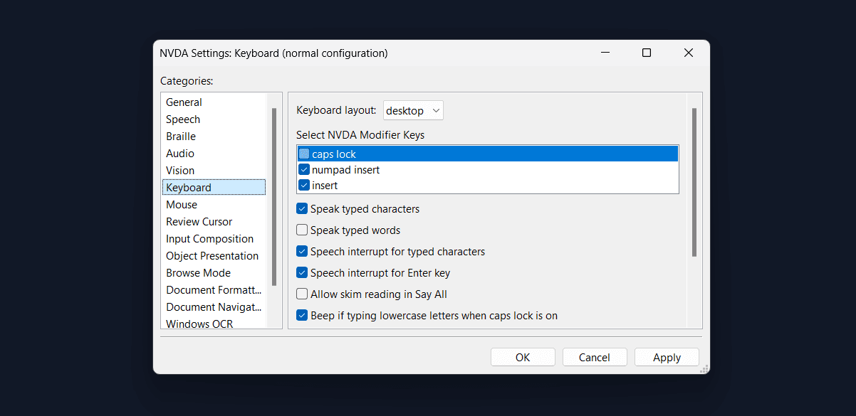
Start by experimenting with the screen readers built into Windows (Narrator) and macOS (VoiceOver). However, only around 10% of screen readers use those two. You should also be testing with NVDA (which is free) and JAWS (which is paid but has a free trial) since the two combined command 78%+ of the screen reader market share.
Create error messages everyone can understand
Using color formatting alone to communicate information is a common accessibility misstep all over the web. But it’s especially problematic in forms. When a user provides input that doesn’t meet a field’s requirements, some forms simply highlight existing field labels in red or show an icon next to the problematic submissions. Those notifications that might be totally invisible to blind and color-blind users.
According to the most recent draft of the Web Content Accessibility Guidelines (WCAG’s) Forms Tutorial, an error message should always be written in text, specify which field has an error, explain the cause of the error (e.g. empty required field, misformatted answer, etc.), and provide an example of an acceptable submission.
For form apps that without customizable error messages, a possible workaround is a conditional textbox that only appears when an earlier field doesn’t meet the input requirements.
Remove placeholder text and floating labels
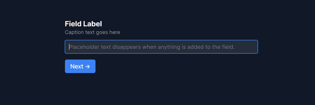
Surprisingly often, accessibility improvements require removing something intended to be helpful. Take placeholder text, for instance, text that appears inside an empty field with instructions or an example answer. The idea is to provide guidance in a way that takes up less space on the page. Experts argue that placeholder text does more harm than good.
Placeholder text is almost always formatted in a low-contrast gray that’s hard to read for low-vision users. It also disappears once the field is in focus or any values are entered. When a user wants to compare what they’ve entered against the placeholder text, they must delete their answer to make the placeholder visible again. If you use it as a place to write field instructions, space is far more limited than a traditional field label. Finally, and worst of all from an accessibility perspective, placeholder text is often invisible to screen readers.
Katie Sherwin writes for Nielsen Norman Group that “Even when using labels, placing important hints or instructions within a form field can still cause issues…placeholder text is generally bad for accessibility.” She goes on to explain that one of the most popular alternatives, float labels, aren’t much better.
Float labels are text that appear within form fields until the field comes into focus or a user enters a value, at which point the label changes its size and location to “float” above the empty field. The label never disappears, doesn’t use a low-contrast font color, and takes up less space on the page than a static field label and empty field.
But, as Sherwin points out “Fields with text in them are less noticeable, and users might think there is already a default value entered in the field,” a questionable UX choice further dragged down by the issue that float labels are tagged in ways that screen reader users ignore.
Nielsen Norman Group’s advice here is simple, “Rather than risk having users stumble while filling out forms or waste valuable time figuring out how they work, the best solution is to have clear, visible labels that are placed outside empty form fields."
Break forms into multiple single-column pages
Most screen reader users have become so accustomed to long, high-word count pages that the first thing they do is read all the headings before reading relevant full paragraphs. For those users (and all others, honestly), short pages with only a few related fields are a welcome reprieve.
WCAG has an entire section on multi-page forms, saying “Where possible, divide long forms into multiple smaller forms that constitute a series of logical steps or stages. This helps make long forms less daunting and easier to understand, particularly for people who are less experienced using computers or who have various cognitive disabilities.”
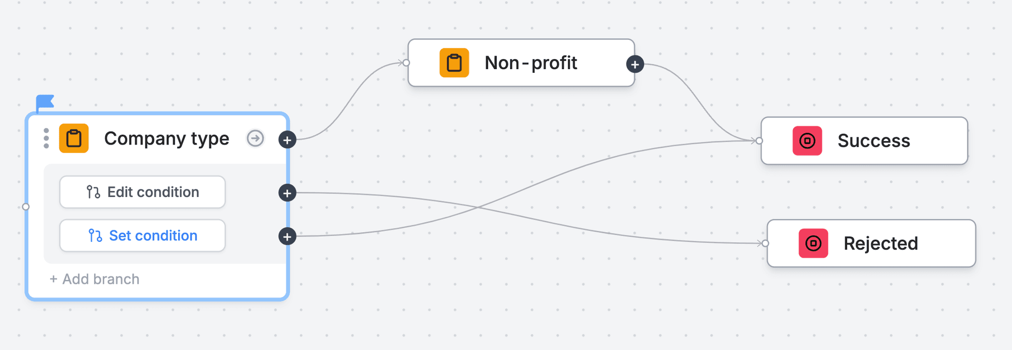
This approach also makes it easier for users to find and fix input errors while providing an alternative to “space-saving” multi-column layouts (which consistently hurt conversion rates). Then, there are the added opportunities for branching logic that helps screen reader users skip unnecessary pages and fields based on previous answers.
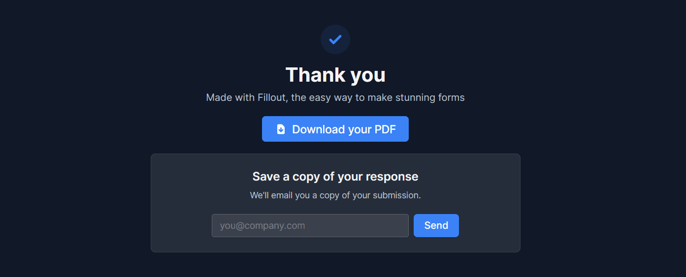
After users have completed all the pages, it’s critical that you provide confirmation of their submission, ideally alongside a way to update any of their answers.
The Gov.uk Design System created the “Check Answers Page” pattern to “Increase users’ confidence as they can clearly see that they have completed all the sections and that their data has been captured.” And “Reduce error rates as users are given a second chance to notice and correct errors before submitting data.”
If you’re using a form app that can’t recreate the Check Answers Page, a simple Make scenario would help you email users receipts of their confirmation and provide a link to another form if they see anything that needs to be changed.
Thinking about accessibility everywhere you interact with users
Some of the improvements that you can make to your forms are applicable to non-interactive web experiences as well.
You should run your logo, landing page designs, and forms through a contrast checker before they go live. Any image on your website or social media posts should have descriptive altext. Videos and audio should always have WCAG-compliant captions and subtitles. Copywriting should always always be easy to understand and consistent.
Making your forms more accessible does take time. Start small. Get used to keyboard navigation, using a screen reader, fixing error messages, placeholders, and long single-page forms. If you can get those down, you’re making your experiences (the broader web) easier to use for millions of people online.
Ready to make the automation revolution happen?


